Back to all projects

Design System

Technway Component Library

A reusable interface system that improves consistency, accessibility, and development speed across Technway projects.

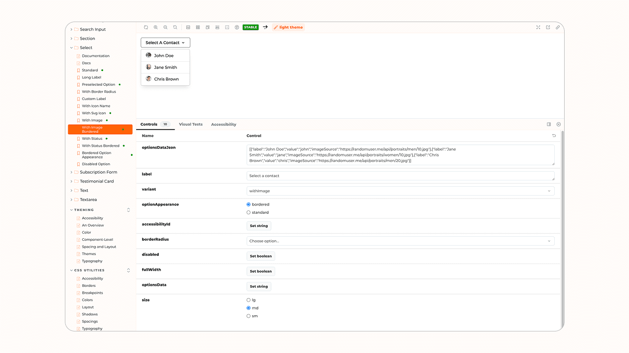
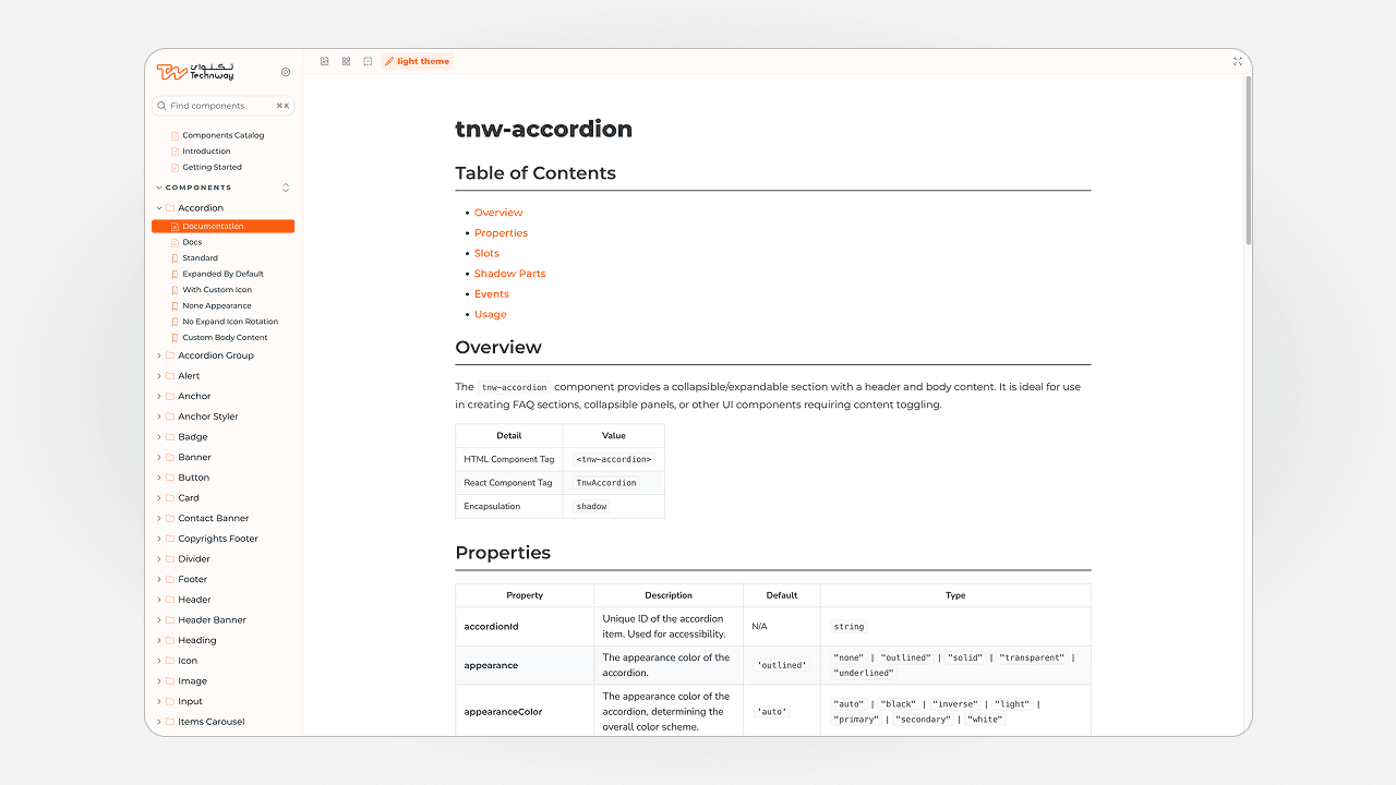
Preview of the Technway Component Library interface

Client

Technway

Year

2026

Project status

Internal Project

Industry

Technology

Services

Web UI/UX Design, Web Development

Technologies

TypeScript, React, Storybook, Tailwind CSS

Case study

02

The Challenge

Repeatedly rebuilding buttons, forms, cards, navigation, and feedback states creates visual inconsistency and duplicated maintenance work. The challenge was to make components flexible enough for different products while preserving predictable behavior and accessibility.

03

Goals

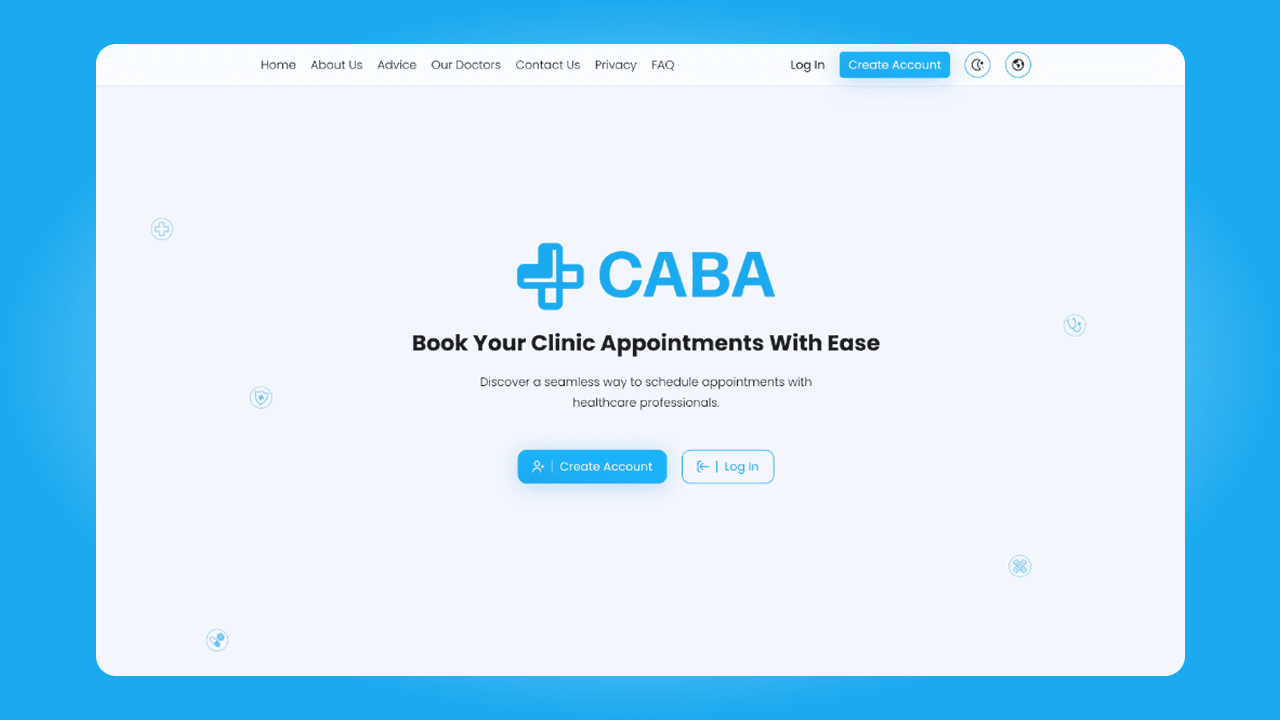
Implemented scopeRole-based flows for patients, doctors, and administrative users.Appointment availability and booking states.Responsive interfaces for key booking and management tasks.API and database structure for the academic case study.Out of scopeProduction deployment for a real clinic.Payments, insurance processing, and integrations with medical record systems.Claims of operational or clinical outcomes.

04

Technway's Role

Design-system planning
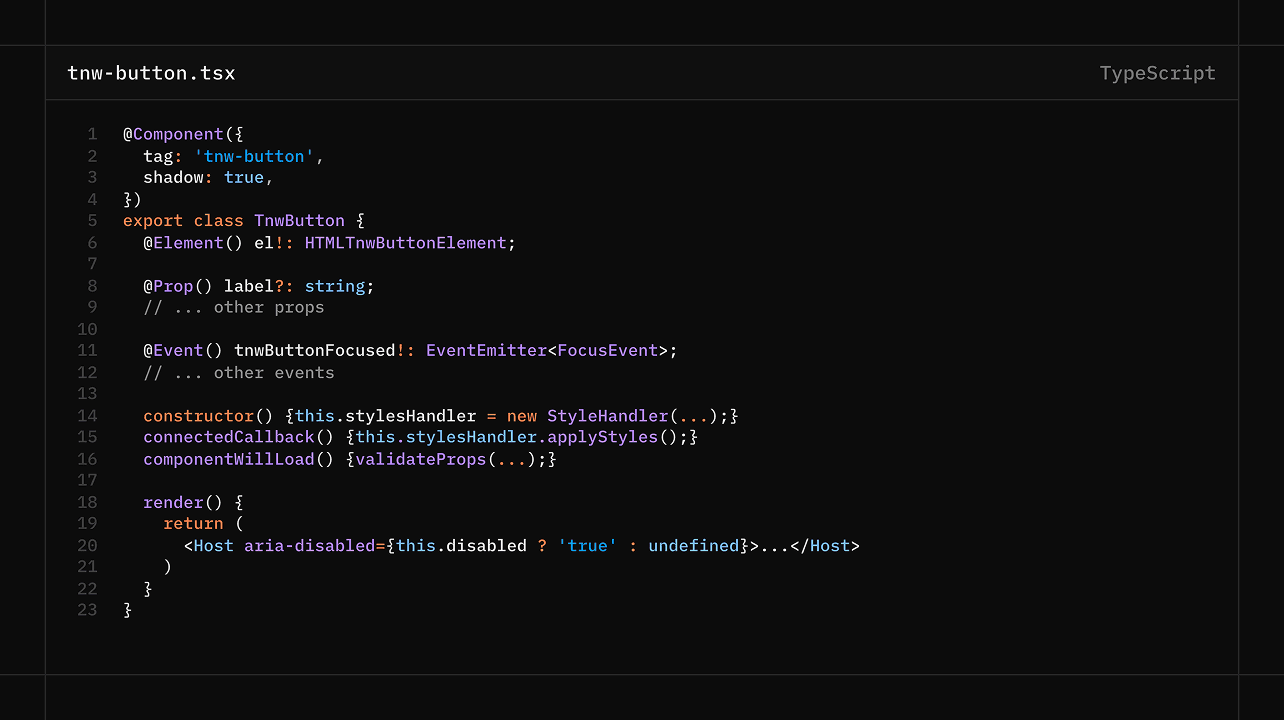
Component API design
UI implementation
Accessibility review
Responsive behavior
Documentation and examples
Maintenance standards

05

Discovery and Approach

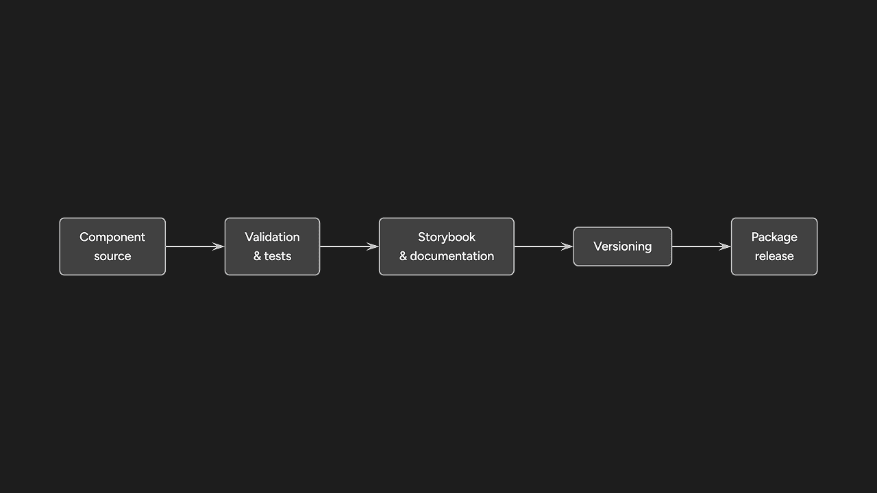
Common patterns were identified across Technway projects and separated into tokens, primitives, components, and composed examples. Each component was designed around a clear responsibility, documented states, predictable properties, and safe extension points.

06

Design and Technical Solution

The library provides reusable controls and layout patterns with consistent typography, spacing, focus behavior, validation states, and responsive rules. Components are documented with practical examples so design and engineering decisions remain visible and repeatable.

07

Accessibility

Components include semantic markup, keyboard interaction, visible focus states, accessible names, validation messaging, reduced-motion handling, and sufficient touch targets as part of their normal implementation.

08

Performance

The library favors lightweight components, shared tokens, and targeted imports rather than requiring a large runtime or a separate animation framework.

09

Testing and Quality Assurance

Components are reviewed across states, responsive widths, keyboard interaction, content variations, and integration examples. Automated test claims should be added only when the relevant suites are enabled in the repository.

10

Results and Key Outcomes

The component structure reduces repeated styling and makes common interface behavior easier to maintain. New pages can reuse established patterns, while changes to shared behavior can be handled in one place.