الانتقال إلى المحتوى

Design System

Technway Component Library

A cross-framework component platform that turns repeated interface patterns into documented Stencil web components, React and Next.js adapters, and reusable layout foundations.
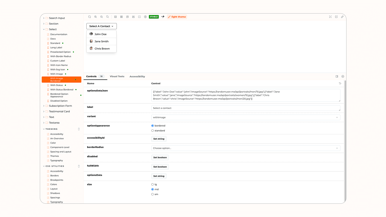
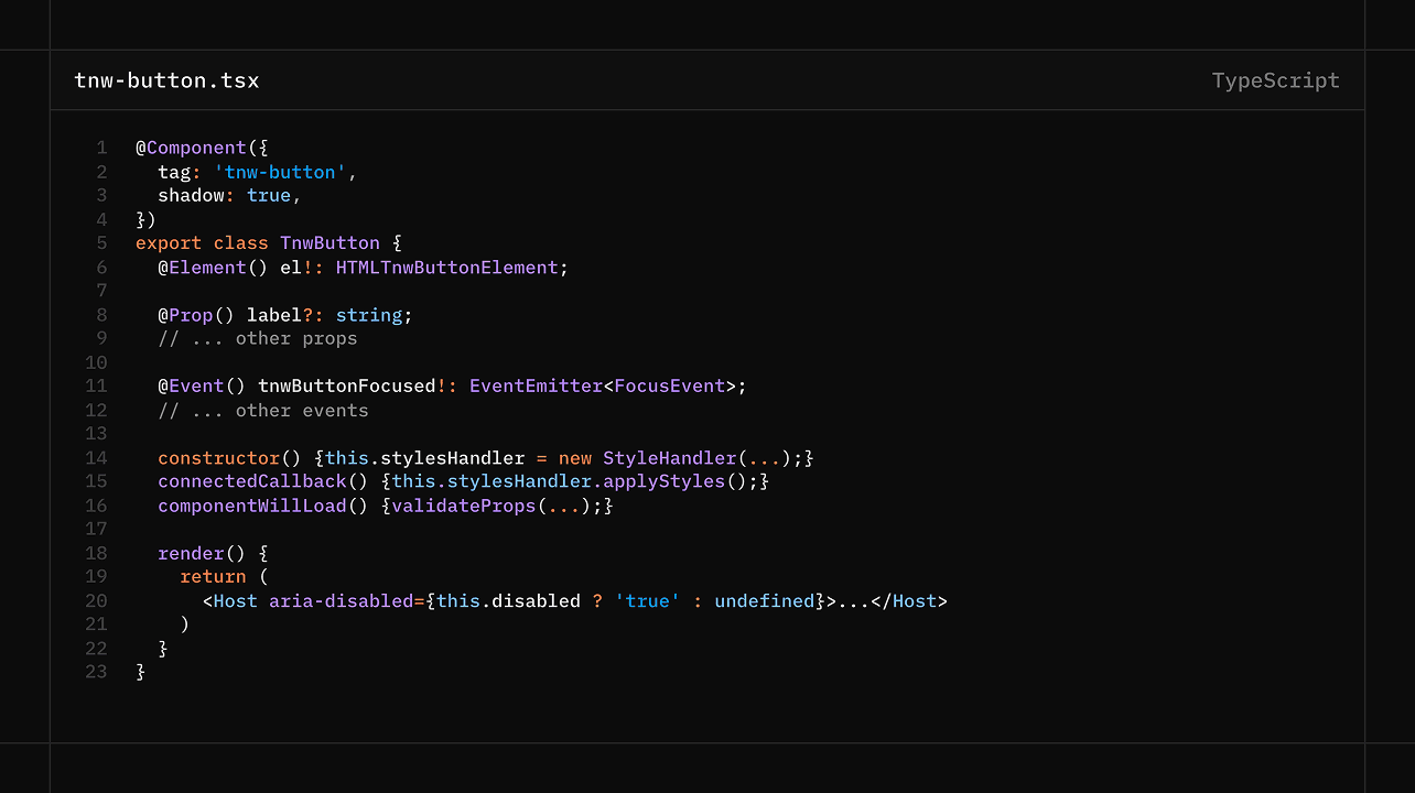
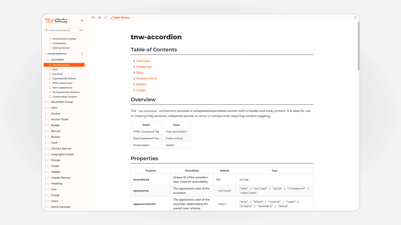
Technway Component Library showing a Storybook component catalog, button states, and a typed API surface

Project Overview

Client
Technway
Year
2024-2025
Project status
Internal Project
Industry
Technology

Services

  • Web UI/UX Design
  • Web Development
  • Web Accessibility

Technologies

  • StencilJS
  • TypeScript
  • Storybook
  • React
  • Next.js
  • Node.js

The Technway Component Library is an internal design-system and engineering platform created to make shared interface behavior reusable without tying every project to one application framework. Its core is a Stencil web-component library, supported by React and Next.js packages, a responsive layout kit, Storybook documentation, and example applications.

The supplied repository contains 34 Shadow DOM components covering form controls, navigation, content, feedback, media, and layout. Generated documentation records 357 props, 35 events, 6 methods, and 58 slots, showing that the system is built around explicit component contracts rather than visual examples alone.

Development began in 2024 and the supplied snapshot includes releases through 2025. The case study presents the implemented repository and its real engineering boundaries without inventing adoption, performance, or delivery-speed metrics.

The Challenge

Repeatedly implementing buttons, form fields, cards, navigation, feedback states, and responsive layouts creates more than visual duplication. Small differences in properties, events, keyboard behavior, validation, and spacing make integration and maintenance harder across products.

The library also needed to work beyond one React application. Components had to preserve a clear API as native web components, React wrappers, and Next.js integrations, including server-rendering and hydration concerns.

The challenge was therefore to build a flexible system with useful defaults, documented extension points, and a release process, while avoiding a library so abstract that it became harder to use than rebuilding the interface locally.

Goals

  • Reusable component contracts. Define narrow responsibilities, typed properties, events, slots, validation states, and predictable interaction behavior.
  • Cross-framework delivery. Keep the Stencil implementation as the source while exposing supported React and Next.js packages.
  • Visible documentation. Provide Storybook stories, generated API references, usage material, and integration examples.
  • Maintainable releases. Organize the work as a pnpm and Lerna monorepo with package versioning and controlled release workflows.

Technway's Role

  • Design-system planning and component inventory.
  • Component API design for props, events, methods, slots, and validation behavior.
  • Stencil and TypeScript implementation across foundational and composed components.
  • React and Next.js package integration, including SSR and hydrate support.
  • Storybook configuration, generated documentation, examples, and RTL preview support.
  • Accessibility review, responsive behavior, issue workflows, and package-release planning.

Discovery and Approach

  1. Start from repeated product patterns. Existing interface needs were grouped into foundations, form controls, navigation, content, feedback, media, and layout rather than collecting unrelated components.
  2. Define the contract before styling. Each component was shaped around typed properties, events, methods, slots, states, and a limited responsibility so consumers know what remains stable.
  3. Separate the core from framework adapters. Stencil owns the web components, while generated React and Next.js packages translate the same source into framework-specific consumption patterns.
  4. Treat documentation and delivery as product work. Storybook, generated API files, example projects, issue templates, versioning, and publishing workflows live in the same repository.

Design and Technical Solution

  • Component core. The Stencil package contains 34 Shadow DOM components, from headings, buttons, inputs, and alerts to headers, footers, navigation, carousels, and portfolio grids.
  • Framework packages. React wrappers and a dedicated Next.js package allow the same component contract to be consumed in client-rendered and server-rendered applications.
  • Layout foundation. A separate layout-kit package provides responsive grid utilities and a React Grid API instead of forcing layout concerns into every component.
  • Documentation surface. The repository includes one Storybook story for each component, generated component statistics and API documentation, MDX usage material, RTL preview tooling, and React and Next.js example projects.

Accessibility

The source shows accessibility treated as a default component concern through semantic elements, visible focus behavior, keyboard interaction, labels, validation feedback, touch-target considerations, and reduced-motion handling where relevant. Storybook includes the accessibility addon, and the component documentation describes accessible behavior for key controls.

The repository snapshot does not include a formal WCAG conformance report, so the case study should describe the implemented practices without claiming complete compliance.

Performance

The library uses native web components and Shadow DOM, supports targeted package imports, and includes a hydrate output for server-rendered Next.js use. Shared CSS utilities and a separate layout package reduce the need to duplicate the same foundations in every application.

No verified bundle comparison or production Core Web Vitals study is included in the supplied repository, so performance is presented as an architectural objective rather than a measured business result.

Testing and Quality Assurance

The repository includes Storybook interaction and accessibility tooling, Jest and Stencil test commands, Playwright configuration, component validation scripts, and GitHub Actions that run on Windows and Ubuntu before release versioning.

The supplied snapshot contains 34 stories and extensive generated documentation, but only limited automated component test files. That is an important engineering limitation and a clear area for future work rather than something the portfolio should hide.

Results and Key Outcomes

  • Documented component system. The repository contains 34 components with a generated API surface of 357 props, 35 events, 6 methods, and 58 slots.
  • Multiple consumption paths. Stencil, React, Next.js, and layout packages are maintained within one pnpm workspace, supported by React and Next.js example applications.
  • Repeatable maintenance. Component stories, API generation, issue templates, changelogs, versioning, and package publishing workflows keep implementation and delivery decisions visible.
  • Honest internal product. The project demonstrates a substantial reusable system while keeping claims about adoption, automated coverage, and measured speed improvements within the evidence available in the repository.

Lessons and Technical Highlights

  • A useful component library is built from repeated product needs, not from maximizing the number of components. Each API should stay narrow enough to understand while allowing deliberate extension.
  • Cross-framework support makes component contracts more important. Ambiguous properties or hidden behavior become harder to maintain once the same component is consumed through native web components, React, and Next.js.
  • Documentation and release automation are necessary, but they do not replace automated behavioral tests. Stronger test coverage should grow alongside the component catalog.
  • Design systems remain useful when accessibility, responsive behavior, ownership, and deprecation decisions are treated as ongoing engineering work.
Technway Component Library showing a Storybook component catalog, button states, and a typed API surface

A component platform, not a page collection

One maintained system connects components, frameworks, documentation, and releases

  • 34 web components

    Controls, navigation, content, feedback, media, and layout patterns built as Shadow DOM components.

  • Four main packages

    Stencil core, React wrappers, Next.js integration, and a reusable layout kit.

  • Documented contracts

    357 props, 35 events, 6 methods, and 58 slots generated from the source.

  • Framework examples

    Dedicated React and Next.js applications demonstrate real package consumption.

  • Storybook workflow

    Component stories, generated API material, accessibility tooling, and RTL preview support.

  • Release structure

    pnpm workspace, Lerna, changelogs, issue templates, CI, and controlled npm publishing workflows.

Component inventory and generated API surface

Component API and documentation

The system makes both the interface and its contract visible

The component catalog groups reusable UI patterns, while generated API statistics and Storybook documentation expose props, events, slots, responsive states, accessibility behavior, and usage examples.

Architecture diagram showing Stencil components delivered through React and Next.js packages with a separate layout kit and example applications
Cross-framework package architecture

One source, multiple frameworks

Stencil remains the core while React and Next.js receive supported integration paths

The monorepo separates component implementation from framework adapters. Stencil provides the web-component contract, React and Next.js packages expose framework-friendly consumption, and the layout kit handles reusable responsive structure.

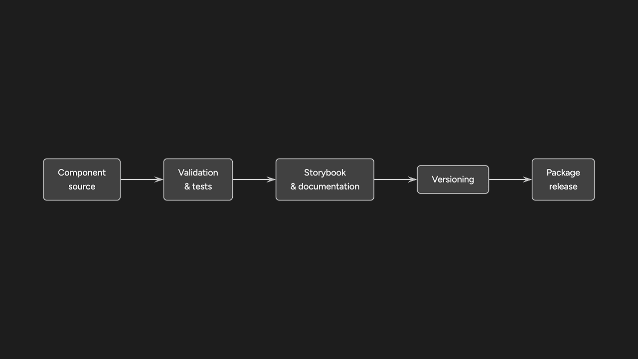
Technway Component Library workflow showing component source, documentation, validation, packages, release, and the current automated testing limitation
From component source to documented and versioned packages

Engineering foundation

Documentation, validation, and release work are part of the product

Generated documentation, example applications, CI across Windows and Ubuntu, versioning, issue templates, and npm publishing workflows give the internal library an operational structure. The current limit is automated component test coverage, which should be expanded as the system grows.

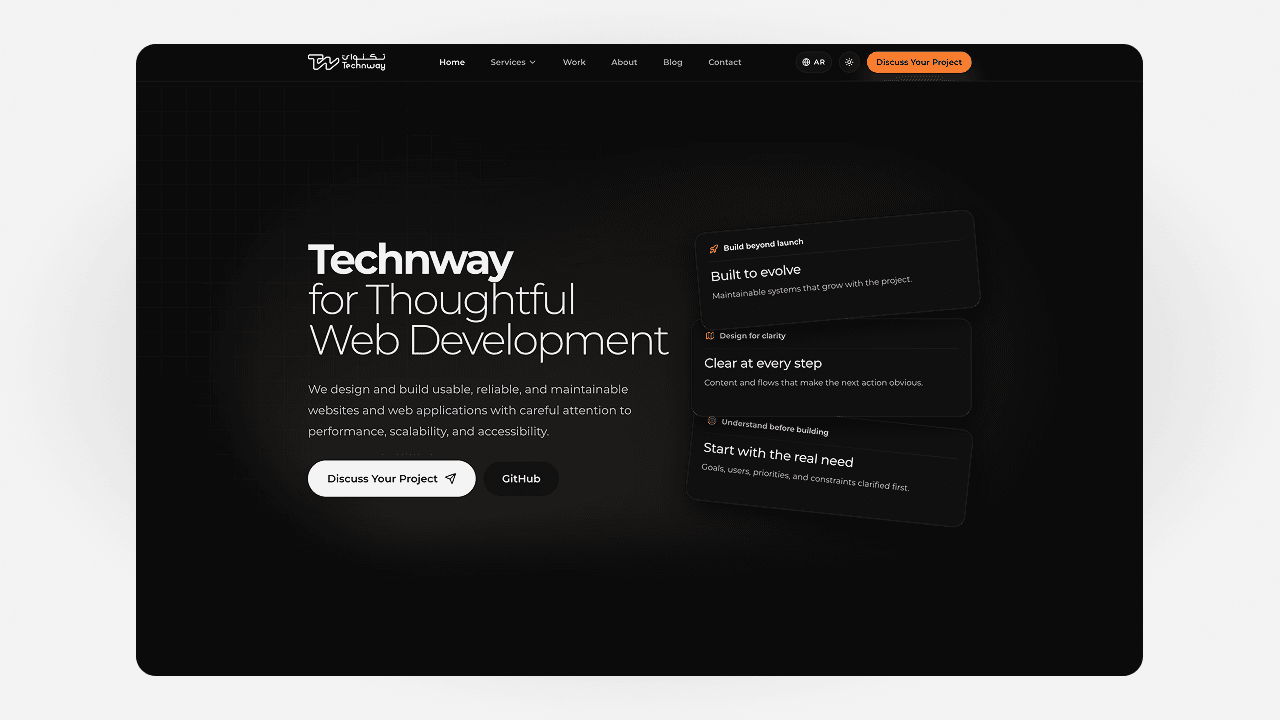
Technway digital platform case study showing bilingual pages, service cards, and the headless content architecture

Headless CMS

Technway Digital Platform

A bilingual corporate website and content platform that combines a carefully designed Next.js experience with a custom headless WordPress editorial system.

View Case Study
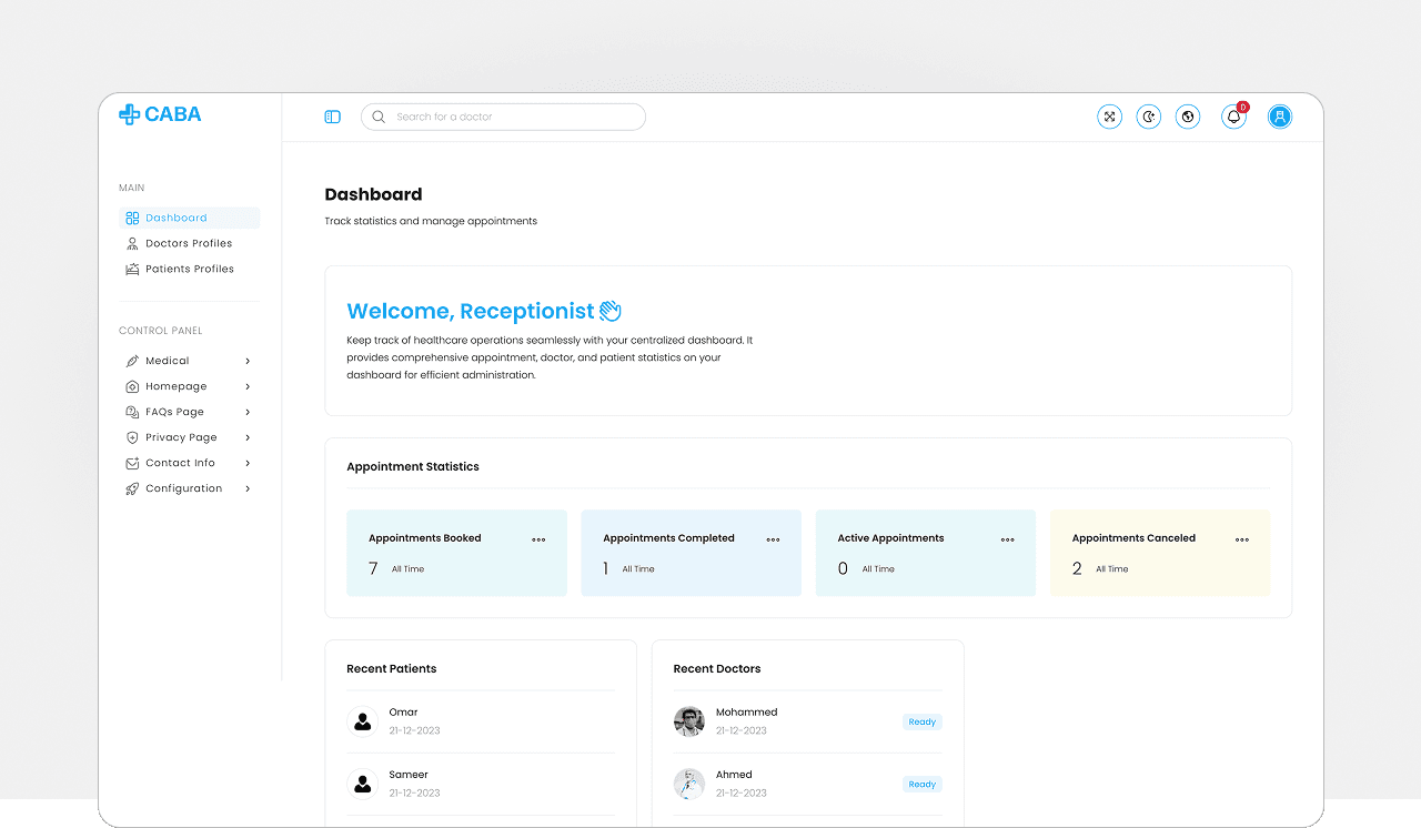
CABA clinic appointment platform showing doctor discovery, appointment booking, availability, and administration interfaces

Web Application

CABA

A bilingual, role-based clinic appointment platform connecting patient booking, doctor availability, and receptionist administration in one custom web application.

View Case Study
Technway Component Library Case Study | Technway Solutions